

Branding · 2026
Café Santa Roça
A brand for the coffee the Fazenda do Monjolo family has grown for four generations, from bean to cup.
From the coffee tree to the shelf
- Client
- Fazenda do Monjolo, Coromandel (MG), Brazil
- What we did
- Audience research
- Brand platform
- Logo and visual identity
- Packaging
- Applications and merchandise
- Year
- 2026
The challenge
A family coffee only friends knew where to buy.
Fazenda do Monjolo, in Coromandel, Minas Gerais, has grown coffee for more than a century, and the same family has run it for four generations. The coffee was sold hand to hand, to relatives, friends and acquaintances, and almost everyone who tried it came back for more.
What was missing was a brand. The family wanted to professionalize sales, starting with coffee and later bringing the farm’s sweets, kettle-made jams and other products. The challenge was to reach the market without losing exactly what made people come back: the story behind every bag.
100+
years of farming
4
generations of one family
0
websites or social accounts before the brand
Before the first sketch
Ask the people who buy.
112each bean is one person who answered
people answered the survey about what they expect from an artisanal food brand.
Household income of respondents
- Above R$ 10k46.4%
- R$ 5k to R$ 10k36.6%
- R$ 3k to R$ 5k8.9%
- Up to R$ 3k8.1%
83% have a household income above R$ 5k: an audience willing to pay for specialty coffee.
What attracts people most in a food brand
Innovation came last. People who buy specialty coffee want quality and a story, not novelty. So the brand speaks of tradition, and the look is simple and sober, with nothing that looks like tech.
- 1Premium quality
- 2Family traditiontie
- 2Sustainabilitytie
- 4Innovationlast
Brand territory
Coffee with memory.
The brand does not compete on the quality of the coffee alone, but on what it carries: the origin, the time and the people.
Manifesto
We believe some things take time.
Time to grow. Time to care. Time to make stories.
In every harvest there is more than coffee.
There is origin. There is memory.
Because the true flavor is not only in the cup.
It is in the stories the cup carries.
Visual identity
A bean with an aura.
The symbol joins a coffee bean and an aura, a subtle nod to the "Santa" (saint) in the name. The strokes above crown the bean and speak of light and of waking up, which is what coffee does every morning.
How the symbol was born
01
The bean.
It all starts with the fruit of the farm: a coffee bean, drawn with full curves and the groove in the middle.
02
The aura.
A ring of light surrounds the bean, the "Santa" in the name, without any religious symbol.
03
Waking up.
Three strokes crown the bean: morning light and the waking up that coffee brings.
04
The name.
"Café" in a thin stroke and "Santa Roça" in strong letters with soft corners: today’s lightness with the strength of tradition.
Colors
Coffee Brown
#642815
The soil, the roasted bean, tradition.
Aura Yellow
#F7A820
Light, warmth and energy.
Off-white
#FDFBF7
Breathing room and soft contrast.
Neutral Black
#212121
Text and reading.
Typography
Gotham in the logo and body text, light for "Café" and heavy for "Santa Roça". Agrandir for headlines.
One bean, a thousand beans.
The bean from the symbol repeats and becomes the brand pattern.
Packaging
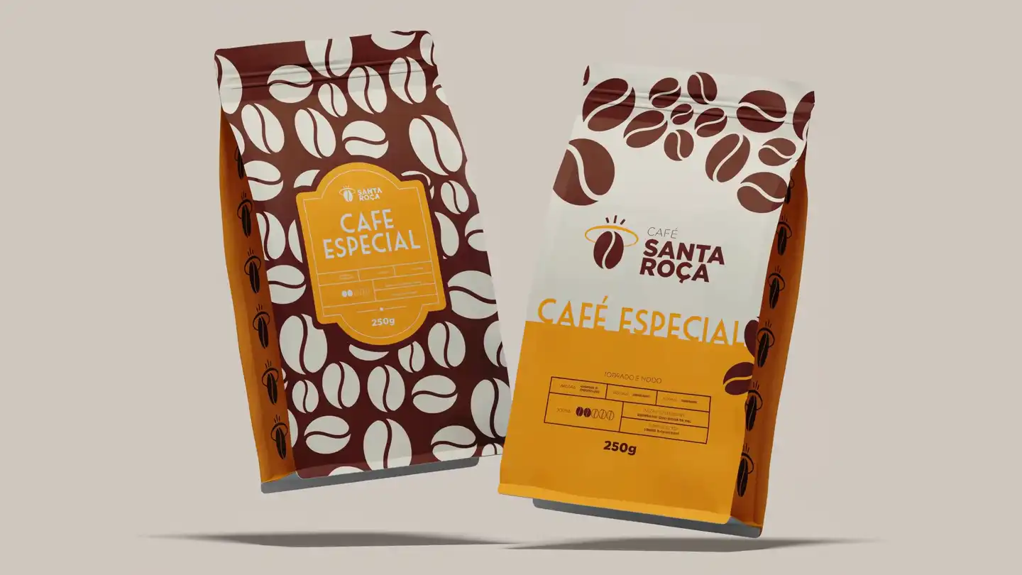
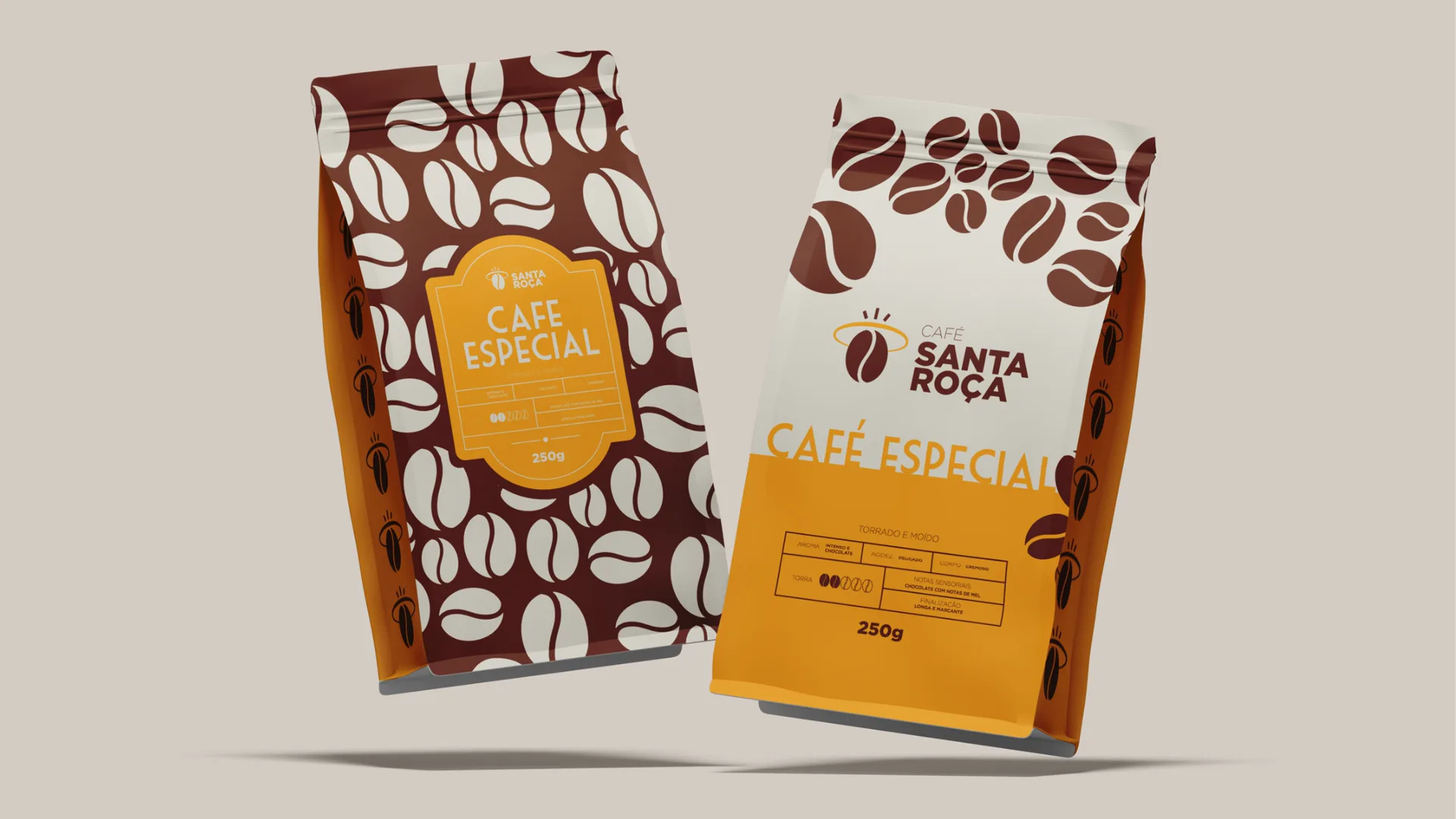
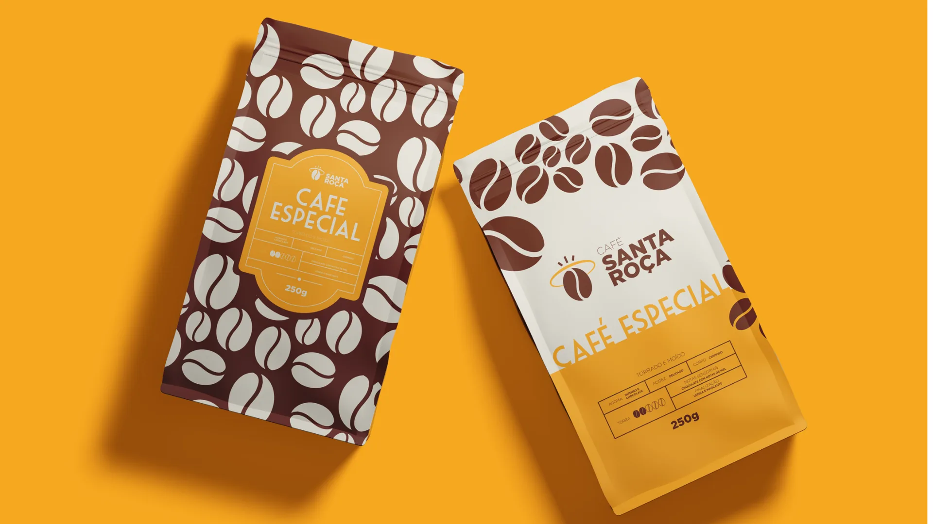
The bean becomes a pattern. The pattern dresses the product.
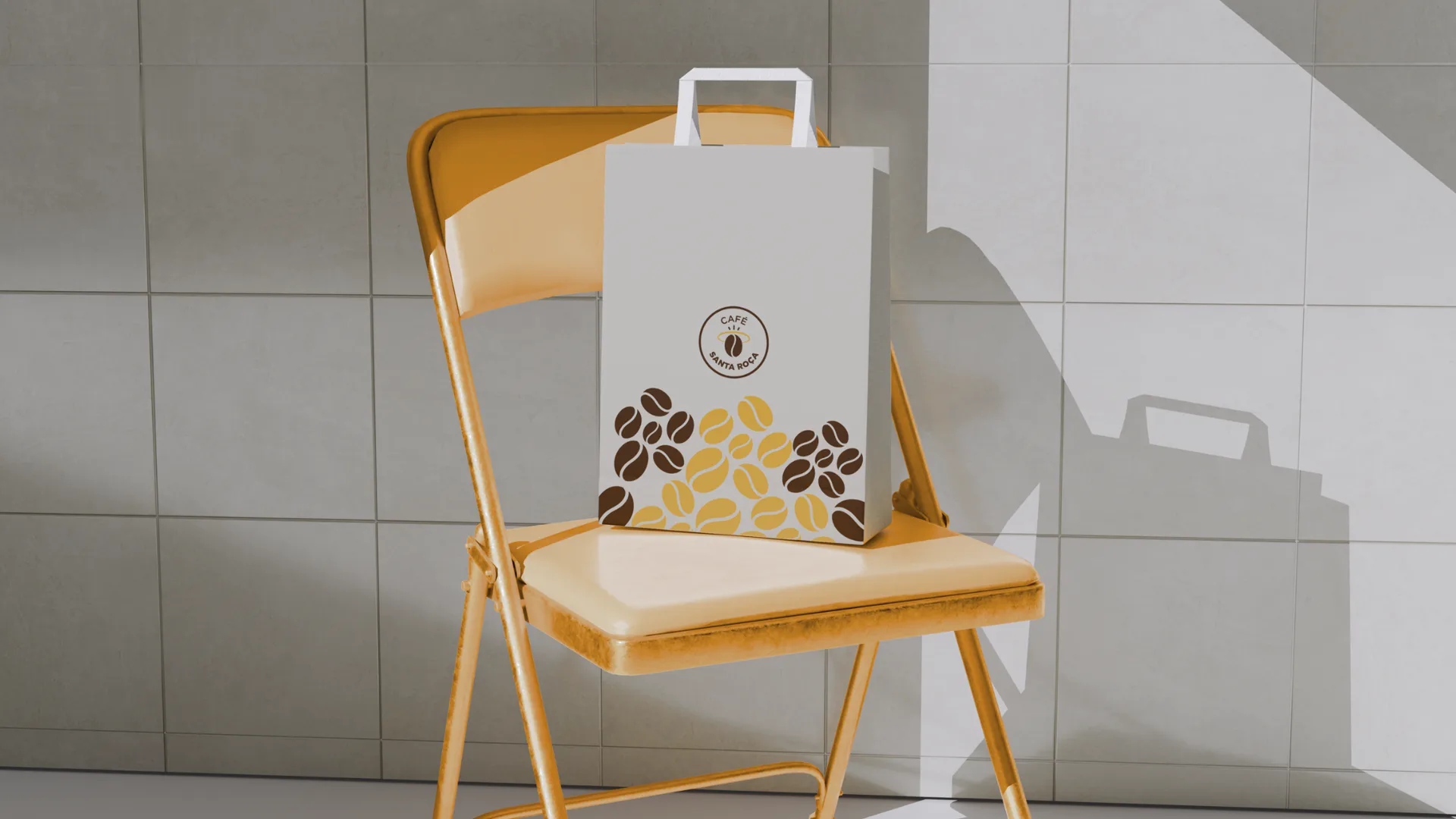
The bean from the symbol, repeated, forms the pattern that covers the packaging in brown, yellow and cream. It is what makes the bag recognizable from across the shelf, before anyone reads the name.
Applications
From the cup to the T-shirt.
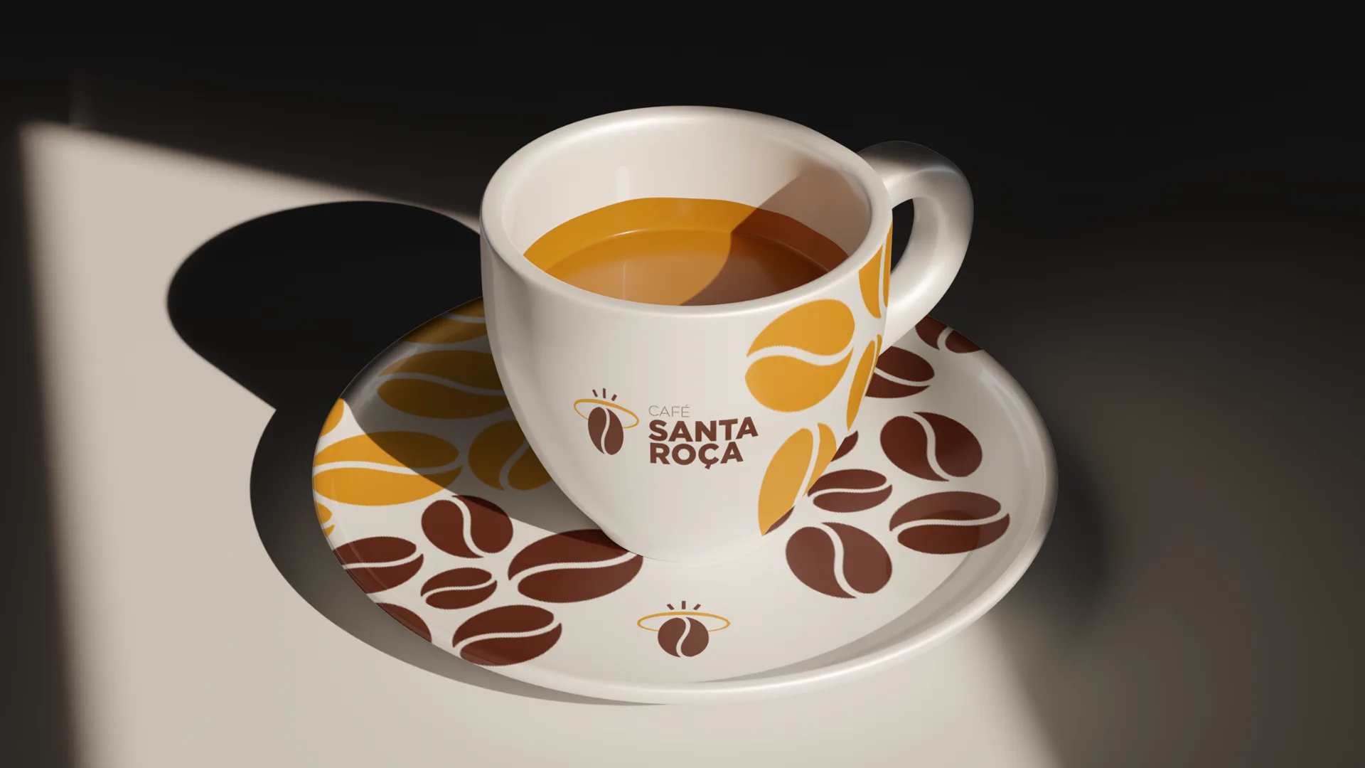
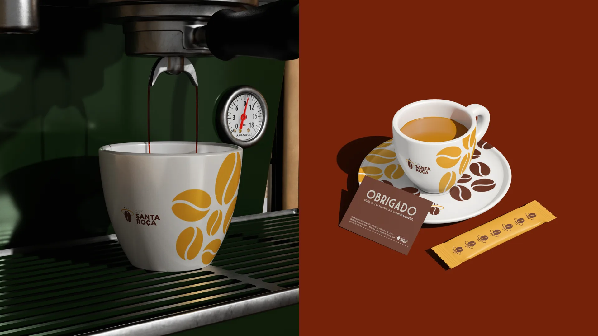
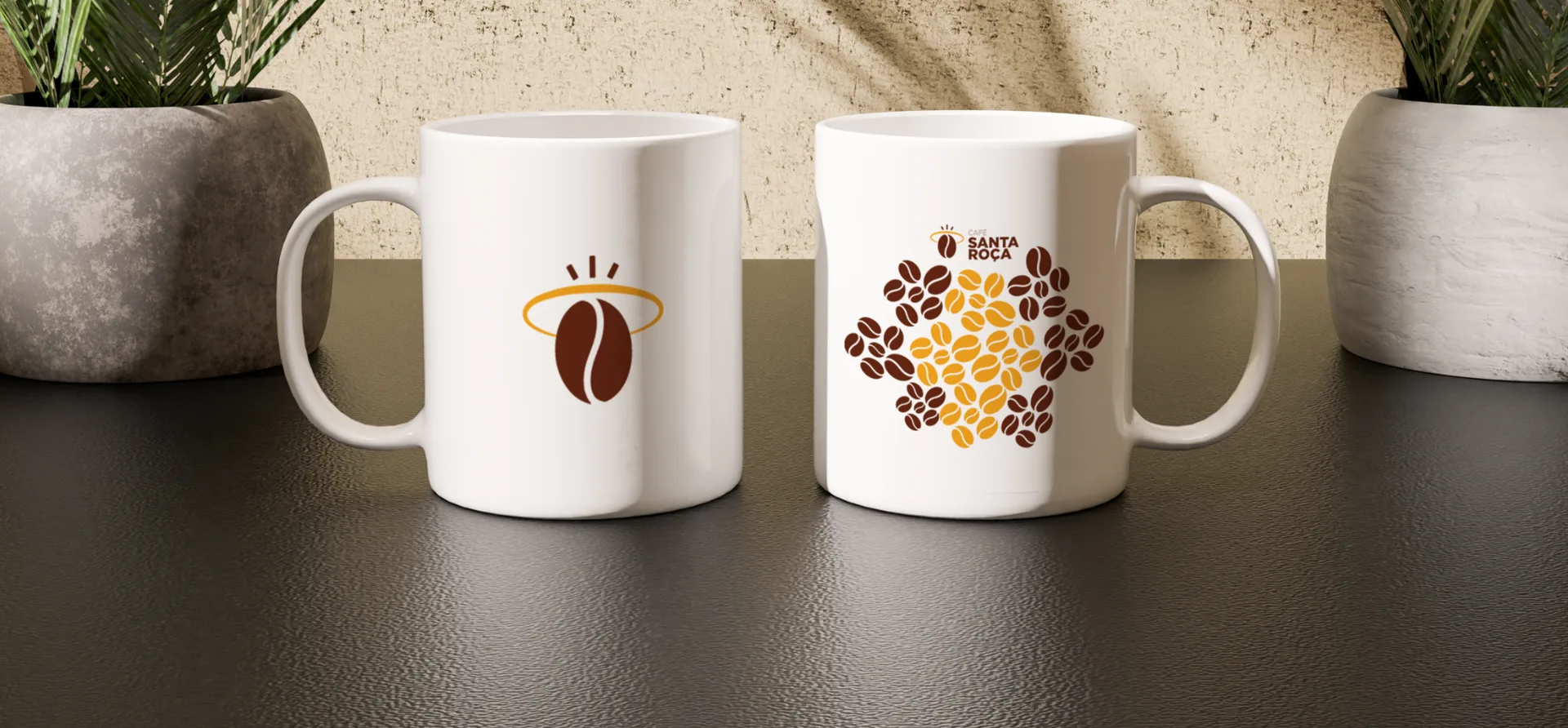
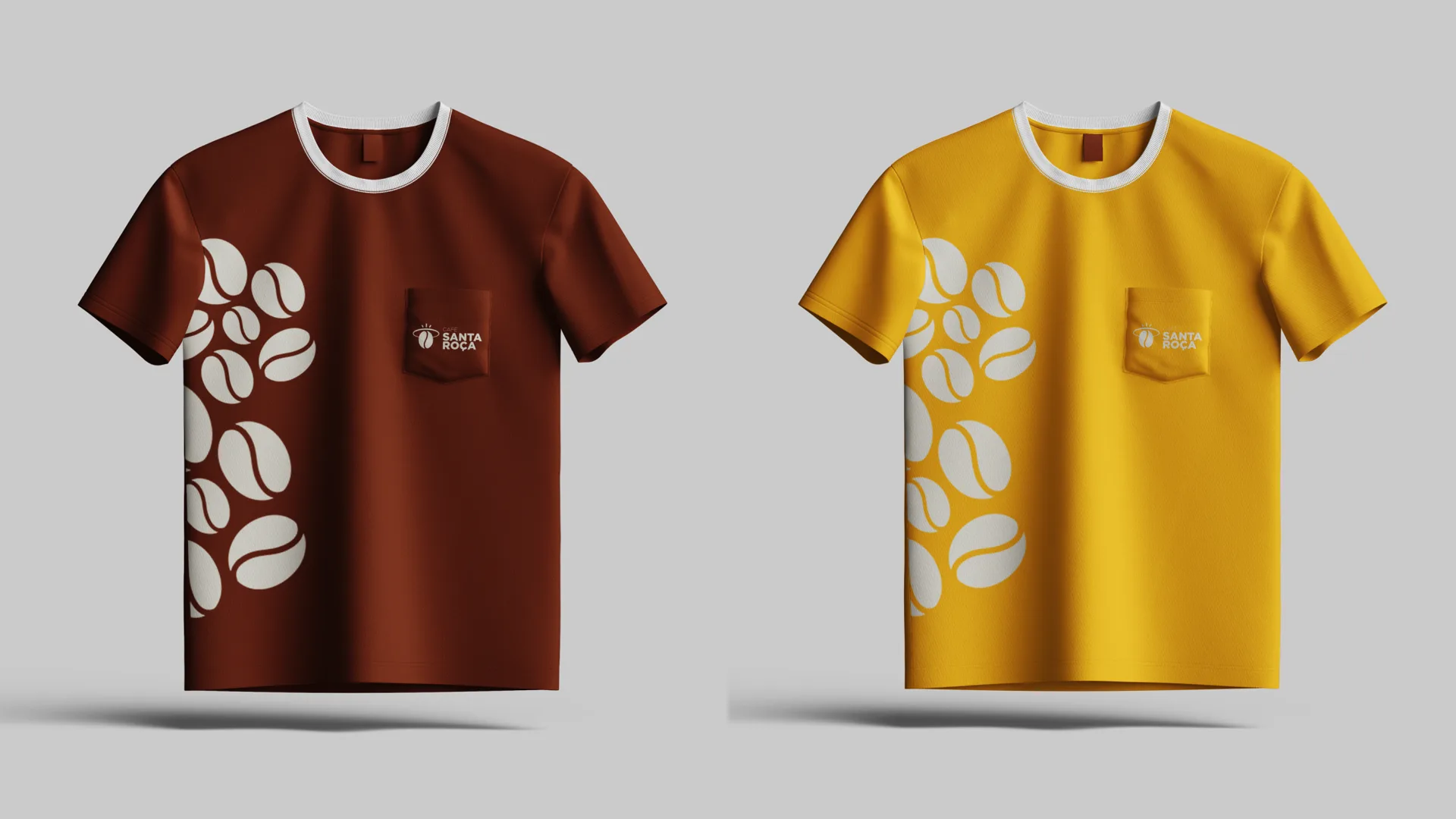
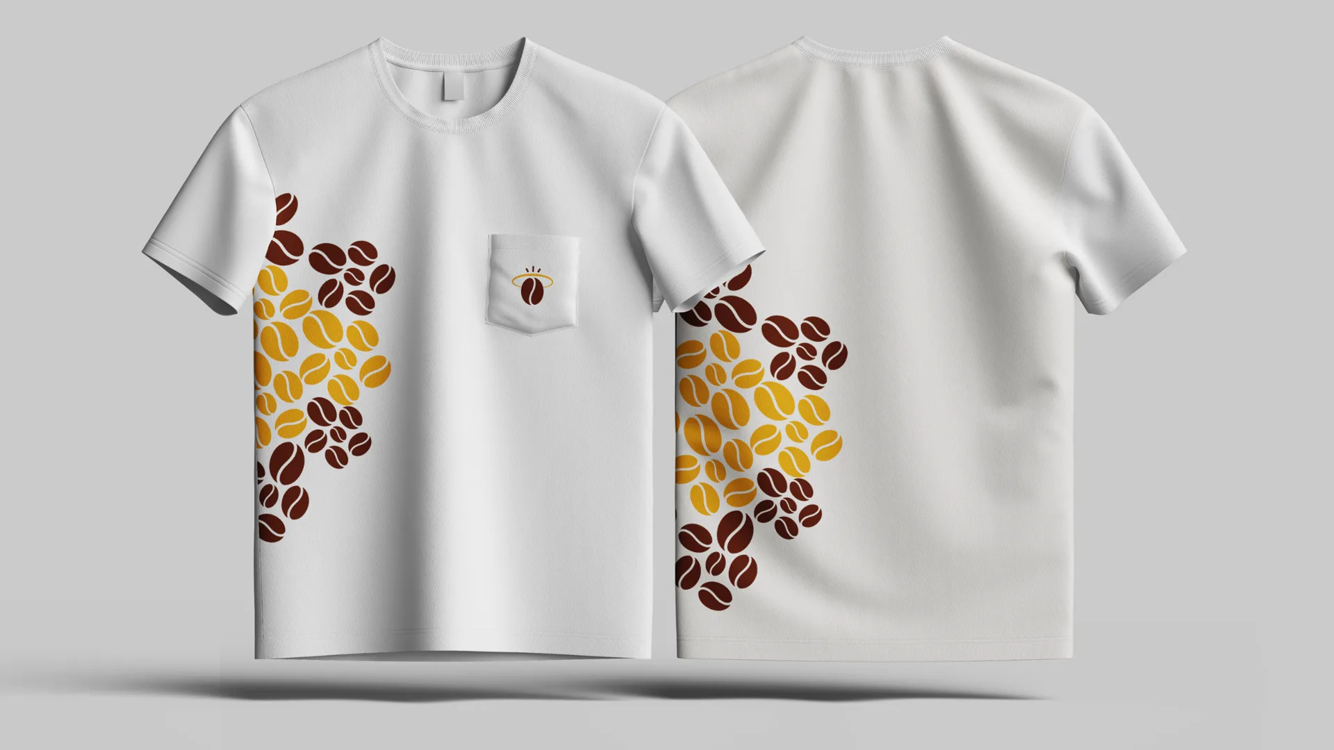
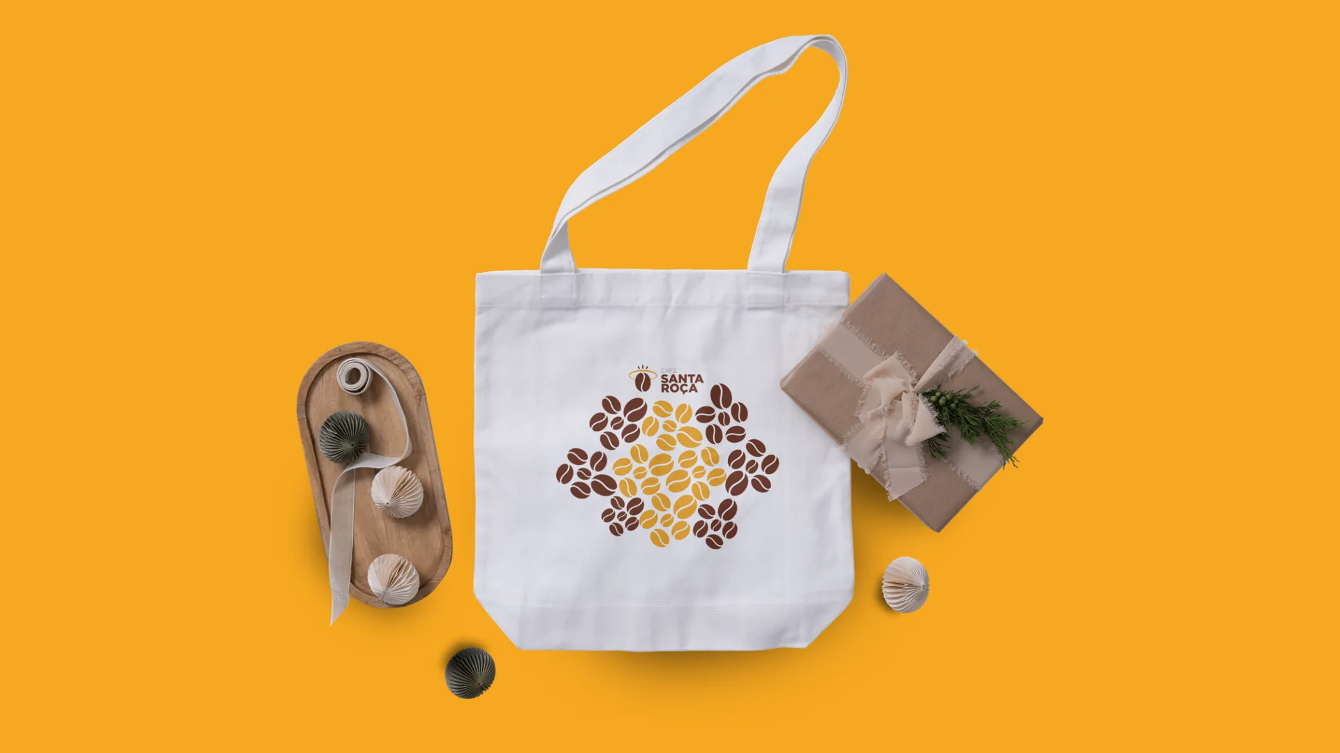
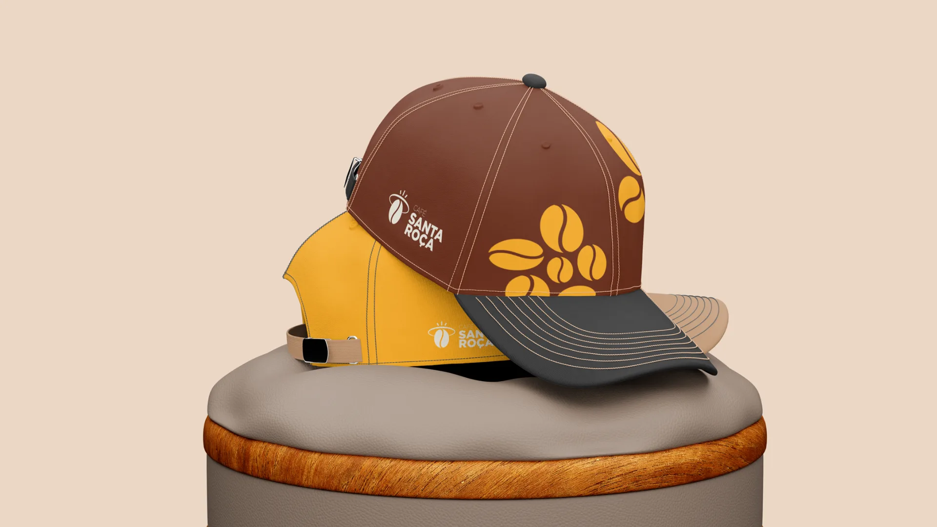
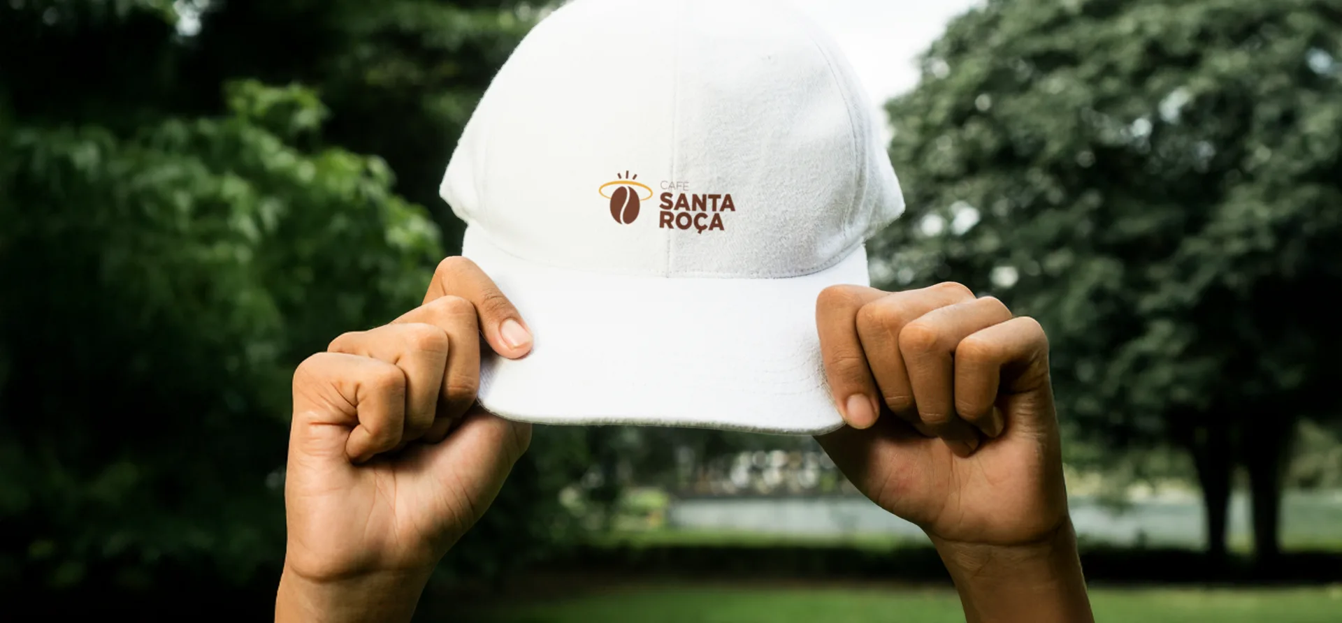
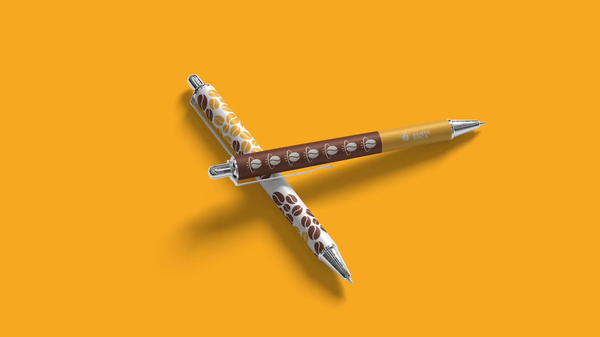
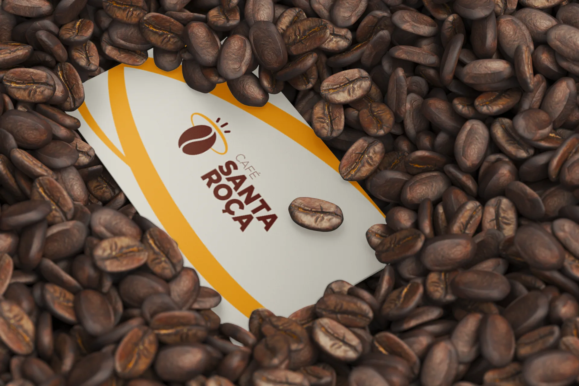
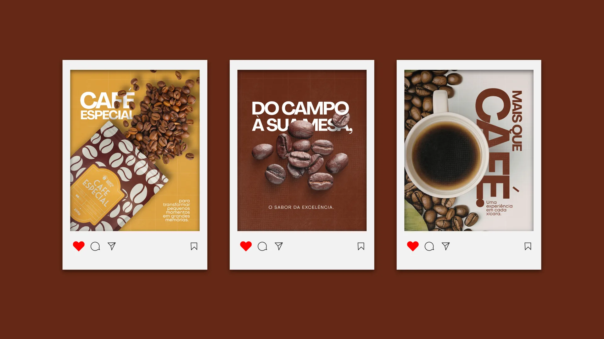
The identity was applied to everything that carries the coffee to people: cups and mugs to serve it, T-shirts, caps, bags, stationery and the first social media posts.
What we delivered
- Consumer survey (112 answers)
- Brand platform: essence, purpose, positioning, values, tone of voice and manifesto
- Logo in three versions (horizontal, vertical and seal)
- Visual identity manual: colors, typography, clear space and usage
- Bean pattern
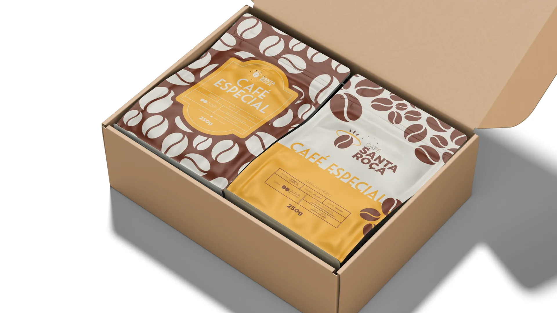
- Packaging and gift box
- Applications: cups, mugs, uniforms, bags, caps and stationery
- Communication strategy and yearly calendar
Does your brand live up to your product?
We start by listening to the people who buy from you and deliver a brand ready to use: logo, visual identity and packaging.