
Branding · 2026
Rede Aromas
A brand for essential oils made by family farmers in Brazil's Atlantic Forest, from a survey with buyers to the package on the shelf.
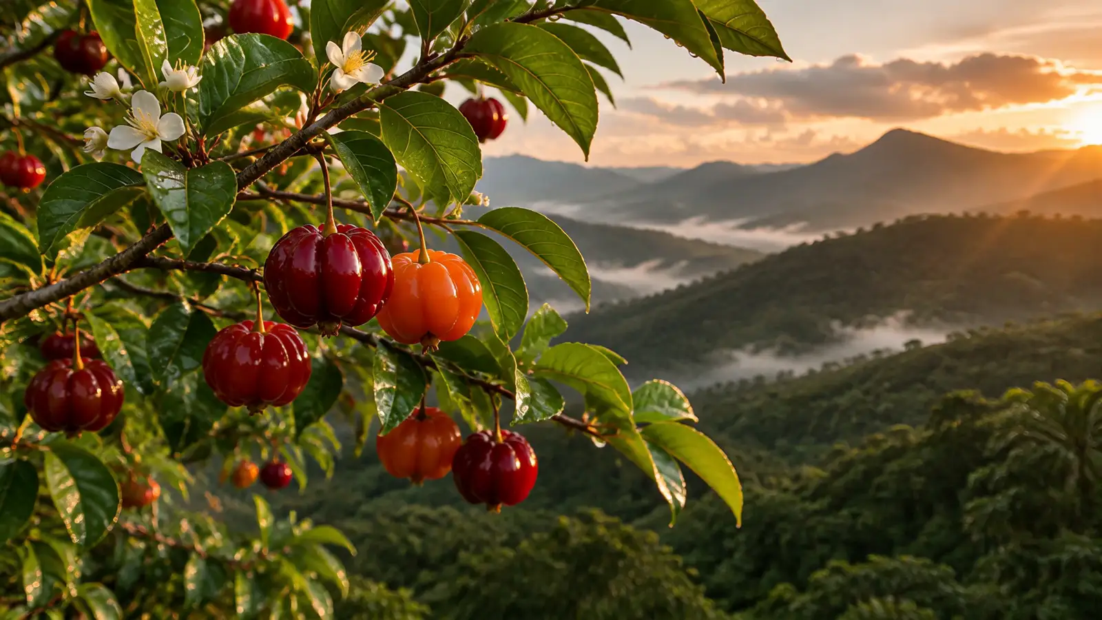
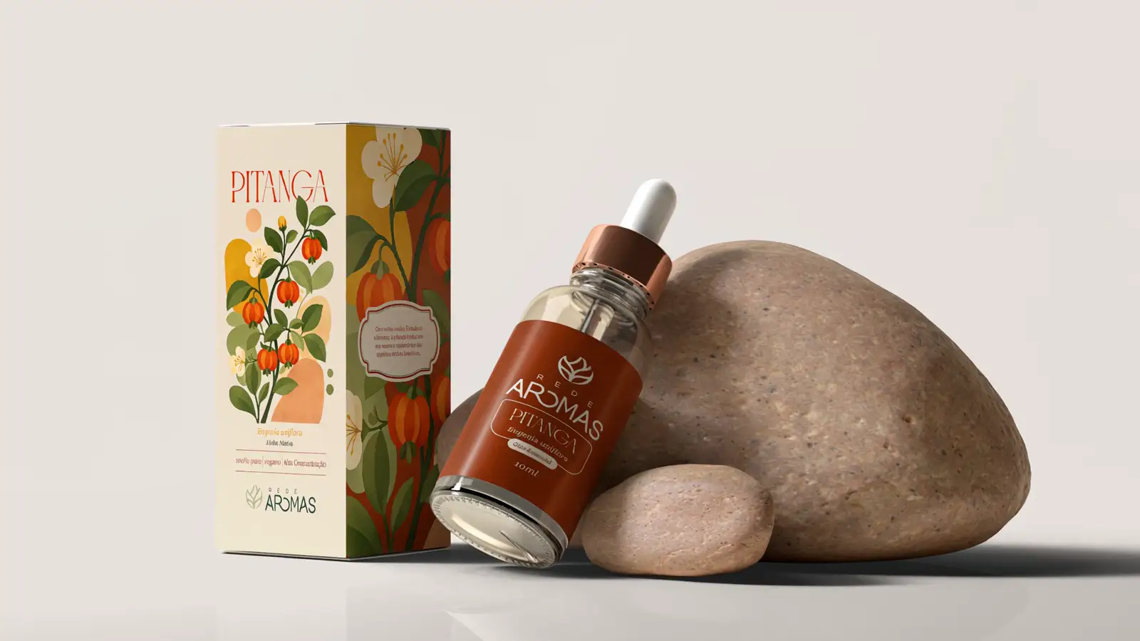
Native line · Pitanga
- Client
- A network of family farmers from Serra do Brigadeiro, Minas Gerais, Brazil
- What we did
- Audience research
- Brand platform
- Logo and visual identity
- Packaging
- Stationery and merchandise
- Year
- 2026
The challenge
A great product, with no brand to tell its story.
Rede Aromas brings together family farmers from Serra do Brigadeiro, in the Atlantic Forest of Minas Gerais. They grow aromatic plants agroecologically and distill their own essential oils.
The oil was good. What was missing was the brand: a name with its own character, an identity and packaging that live up to what is inside the bottle, to compete in the natural wellness market.
Research
141
consumers heard before the first sketch
What drives the purchase
- Quality
- Provenance
- Sustainability
- Efficacy
- Connection with the producers
Who answered
- 18 – 240.7%
- 25 – 3429.8%
- 35 – 4420.6%
- 45 – 5419.1%
- 55+29.8%
- Women75.9%
- Men24.1%
- Yes62.4%
- No37.6%
The respondents are mostly women, especially between 25 and 34 and over 55, and most of them have children.
This points to an audience whose purchase decisions are driven by care for the home, the family and their own emotional health. For Rede Aromas, it calls for communication about everyday wellbeing, not only the sensory appeal of the products. More than selling aromas, the brand should communicate function, trust and solutions that fit the routine.
The survey shows real demand for a brand like Rede Aromas, but the competitive edge will not be the product alone. It will be the combination of trust, origin, quality, experience and sustainability.
The space identified is that of a Brazilian botanical wellness brand with accessible premium positioning, able to answer the pains the audience pointed out: lack of transparency, price sensitivity and lack of innovation.
The main strategic conclusion
is that Rede Aromas should not be born as an oil maker, but as a brand of the culture of care, in a growing market and backed by a clear, contemporary value proposition.
Strategy
Regenerative botanical care.
A territory of its own: not just aromatherapy, not just natural cosmetics, not just an agroecology project. The brand competes on story, trust and perceived value, not on price.
Archetype
60% Caregiver
“You can trust this care.”
30% Sage
Real knowledge behind it.
10% Creator
WelcomingWiseSensoryTrustworthy
Who the brand speaks to
The brand can be built to speak with three core personas.

Mariana, 38
Self-employed professional and mother, who wants to reduce stress, sleep better and make home a more pleasant place.

Helena, 57
Natural health consumer, who values purity, efficacy and credibility.
Laura, 31
Conscious lifestyle consumer, into aesthetics, sensory experiences and brands with purpose.
These personas show the brand has to balance three dimensions: function, credibility and desire.
Brand archetypes
The archetype choice organizes the symbolic expression of the brand and keeps language, look and behavior consistent.
Main archetype · 60%
The Caregiver
The brand protects, nurtures, welcomes and promotes wellbeing.
The Caregiver sums up the most central emotional promise of the brand: trust through care.
It fits the botanical world, the idea of whole-person health and the relationship the brand wants to build.
Shows up as: care · wholeness · trust · welcome · safety · generosity
“You can trust this care.”
Secondary archetype · 30%
The Sage
Brings knowledge, discernment and truth.
The Sage balances the Caregiver’s emotional side with authority and depth.
The brand does not rest on affection alone, but on technical legitimacy and knowledge.
Shows up as: education · depth · credibility · research · botanical intelligence
“There is real knowledge behind what we offer.”
Differentiating archetype · 10%
The Creator
In a lighter dose.
The Creator is a complementary layer, because there is innovation in the formulas, the blends and the network model itself.
It is not central, so the brand does not drift into overly experimental ground.
The mix avoids two risks: looking like just another generic therapeutic brand, or a cold technical one.

Visual identity
From plant to aroma.
The concept follows the path the product takes: from the plant, grown with respect for the land, to the essence in the bottle.
Logo
01
A circle and an axis.
The symbol is drawn on two simple shapes: the circle of the land and the central axis the plant grows from.
02
Leaves growing from one stem.
The branches come out of the same stem and open up to the edge of the circle: growth, biodiversity and a bond with nature.
03
Lettering as light as the aroma.
Thin strokes and open curves, like the O in AROMAS, which never closes.
04
The same brand in every palette color.
Deep green, sage and terracotta: the brand works on every background of the identity.
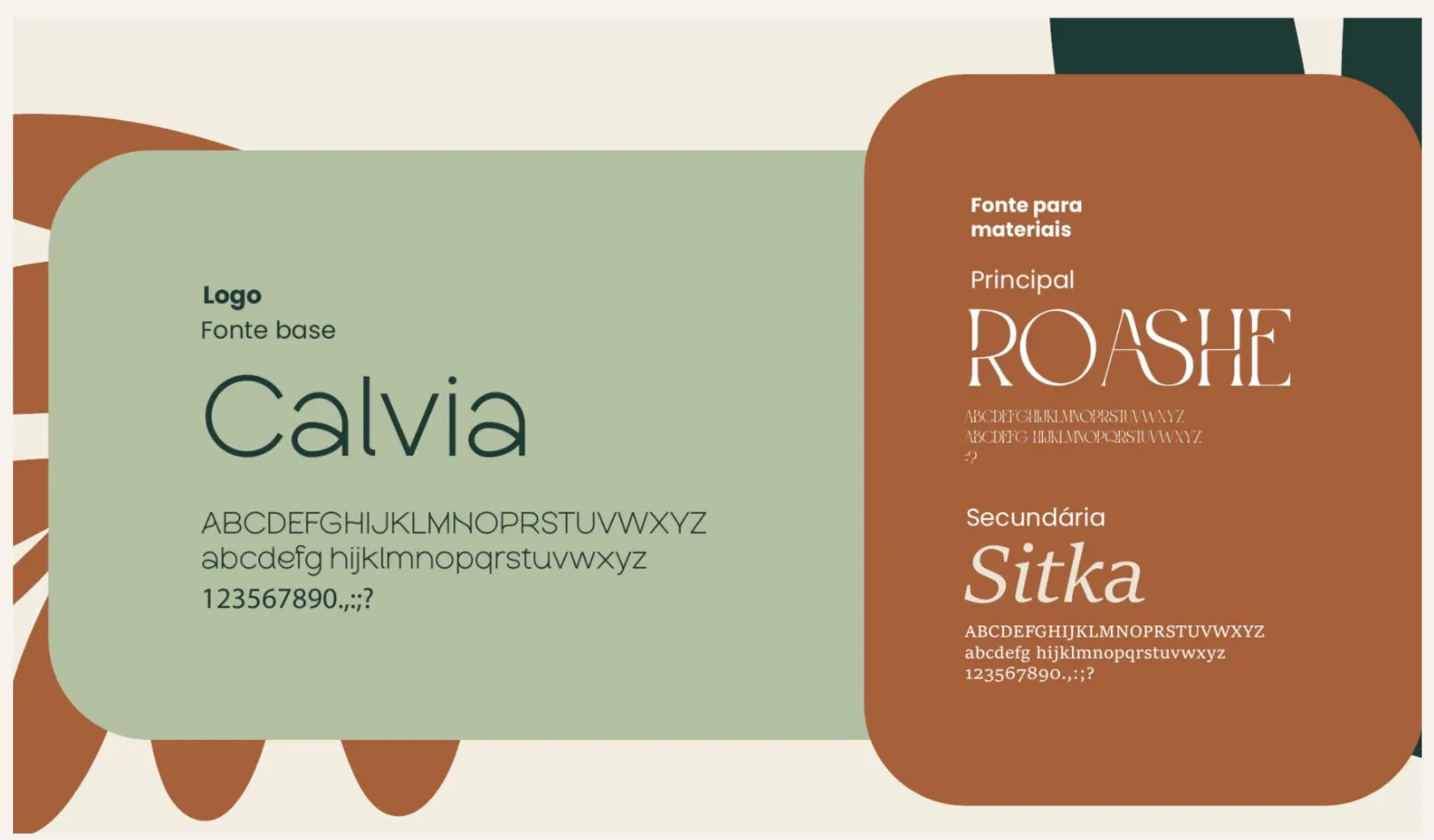
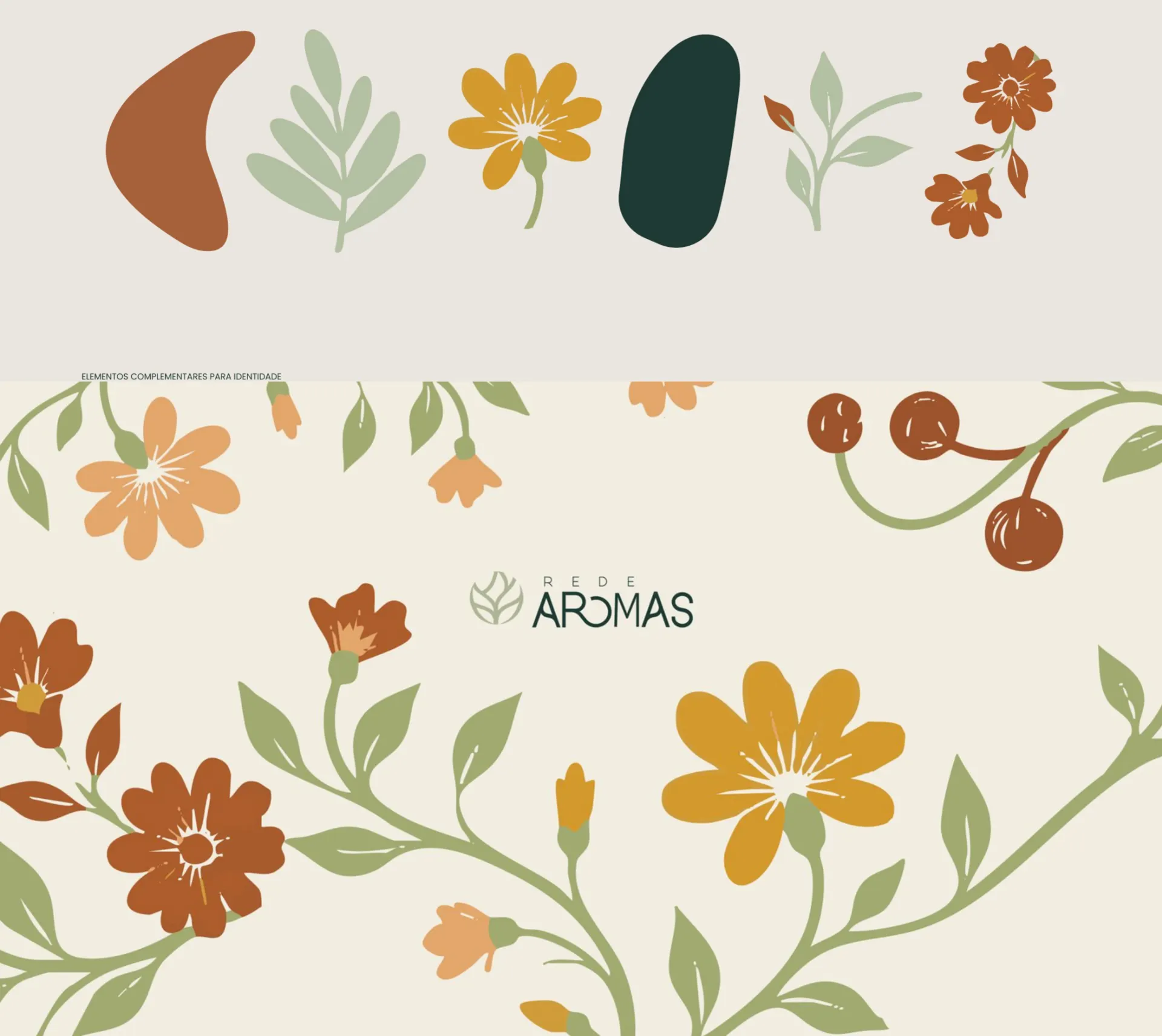
The colors were picked from the land: the deep green of the forest, sage green, and the yellow and terracotta of the soil. In the typography, Calvia is the base of the logo, Roashe signs the plant names and titles, and Sitka carries the supporting text and scientific names. Flowers, leaves and seeds become the graphic elements used at every point of contact.
Color palette
- #1E3A34
- #B3C1A2
- #D3992D
- #AD5C2C
- #EBE6DF
- #2B2B2B
Packaging
Three lines, one family.
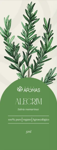
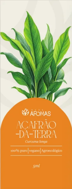
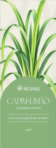
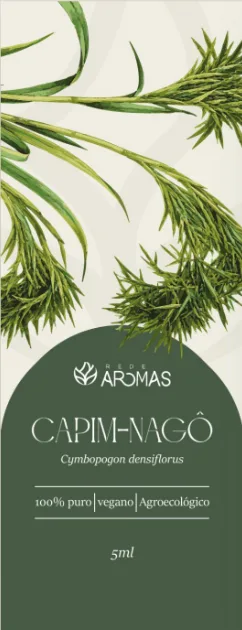
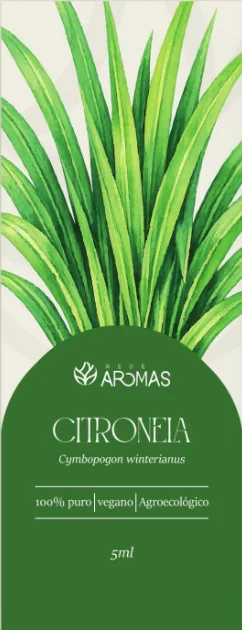
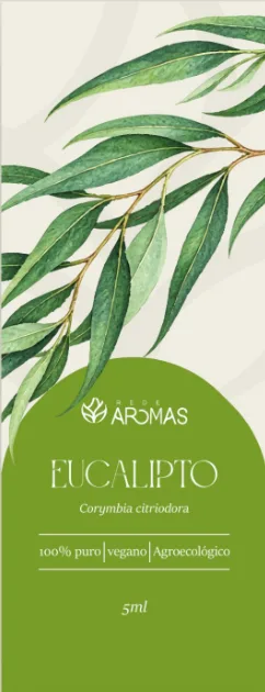
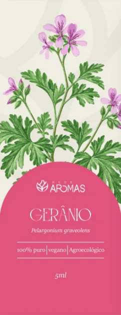
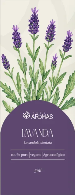
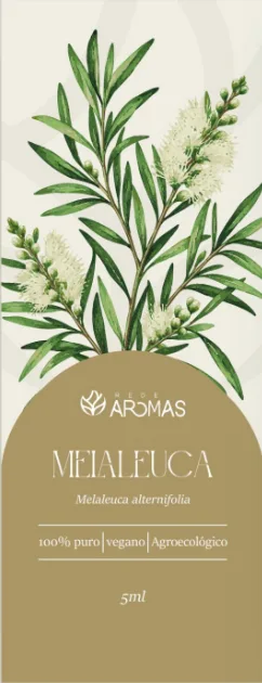
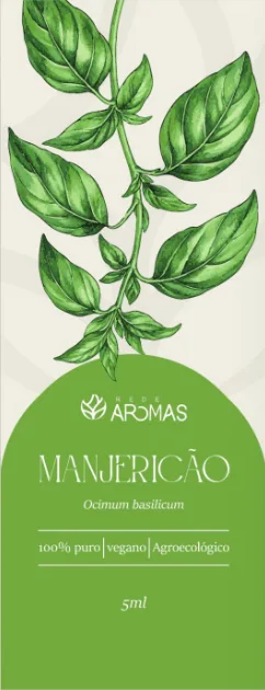
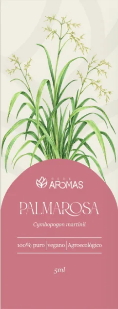
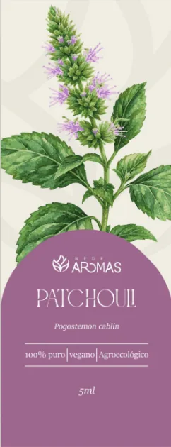
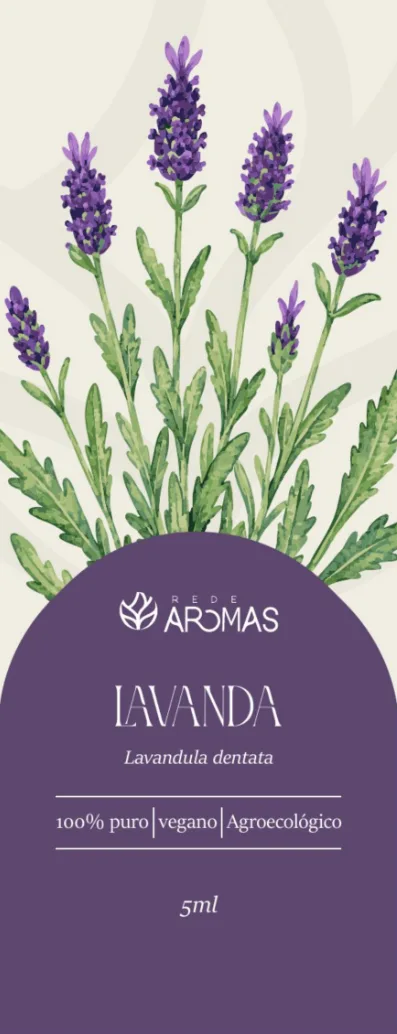
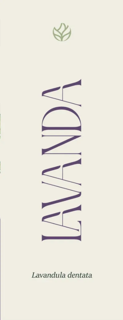
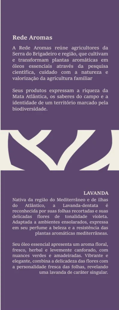
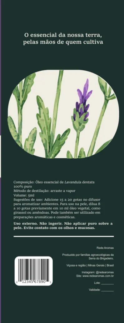
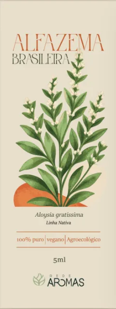
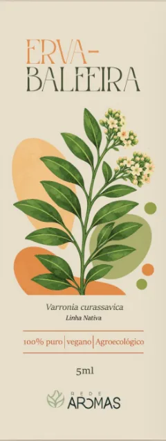
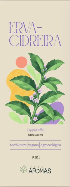
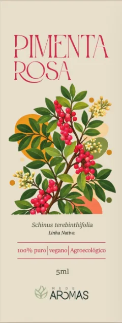
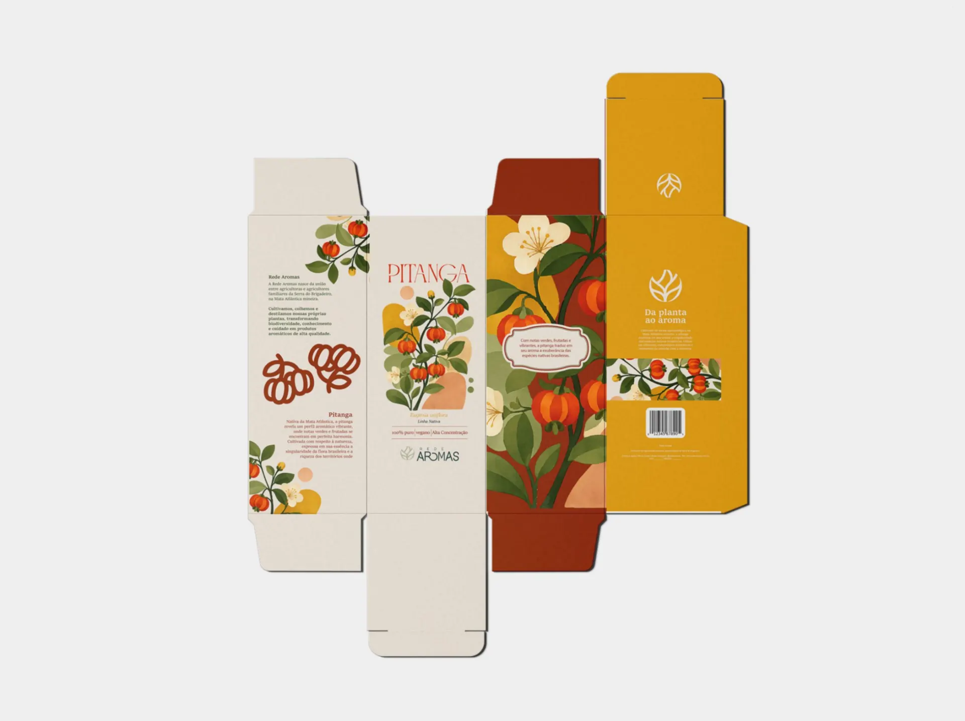
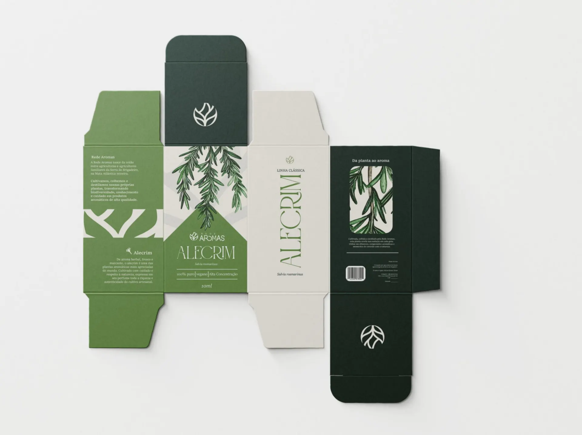
Each species got its own color and a botanical illustration. That system lets the range grow without losing unity: a new plant comes in with its color and its drawing, and the shelf still looks like one family.
- Classic line: 12 plants, one system. The illustration fills the top of the box, and a colored arch identifies each oil, with the common name, the scientific name and the 100% pure, vegan and agroecological seals.
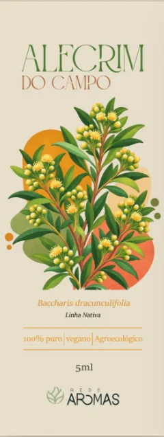
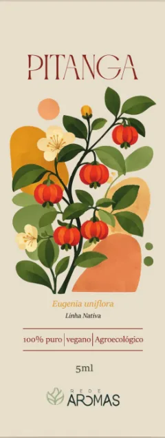
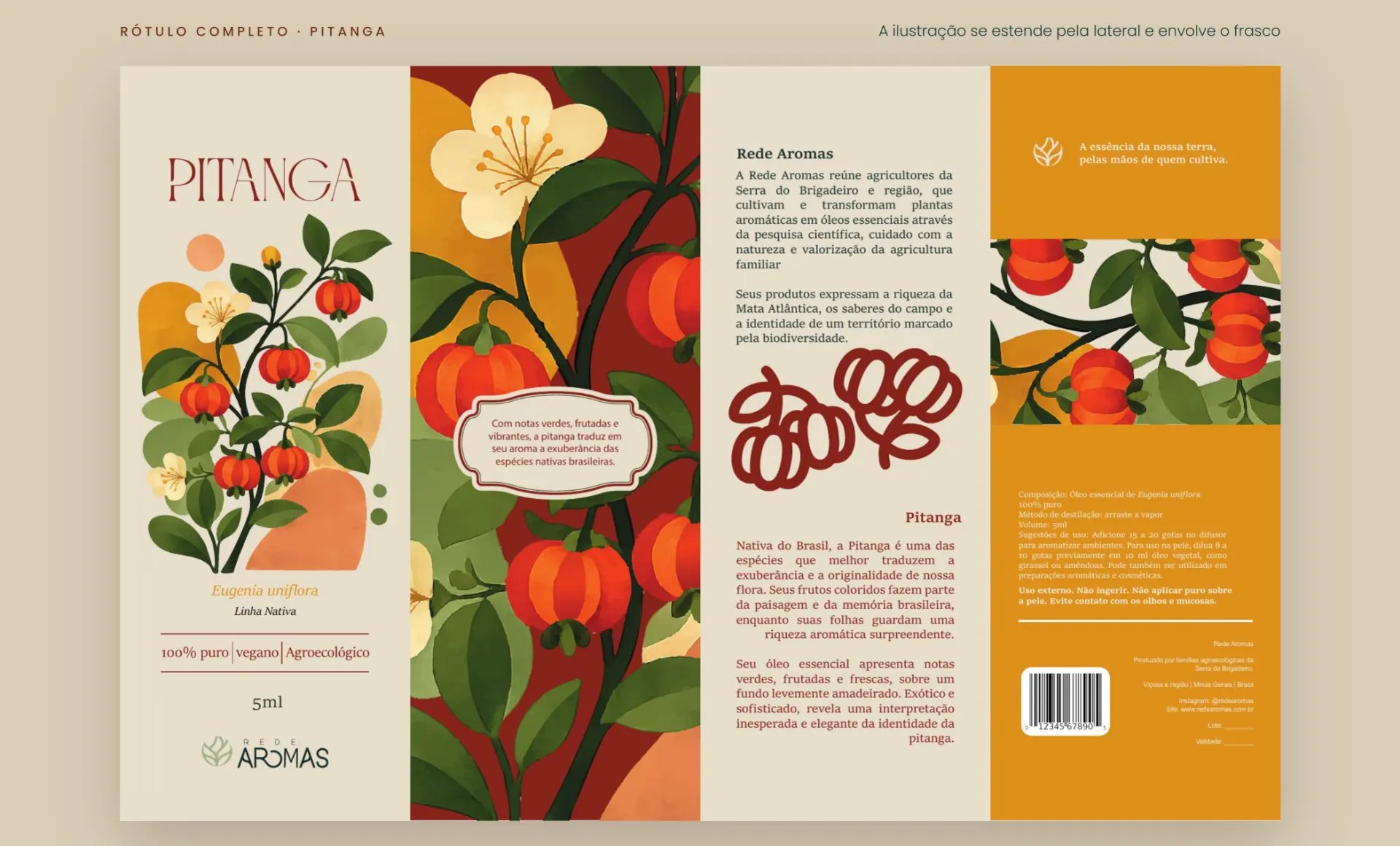
- Native line: six species from Brazilian flora, such as pitanga (Surinam cherry), pink pepper and erva-baleeira, with vibrant illustrations. It is the line that best expresses the brand’s land.
- Synergy line: five blends named after a feeling (Eu Sou, Bom Soninho, Flor, Caule and Semente). Side by side, the boxes form a single landscape.
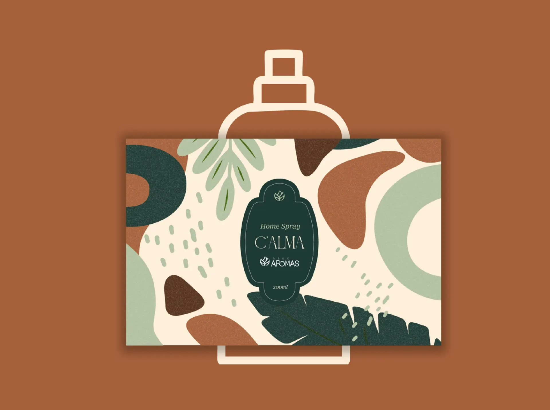
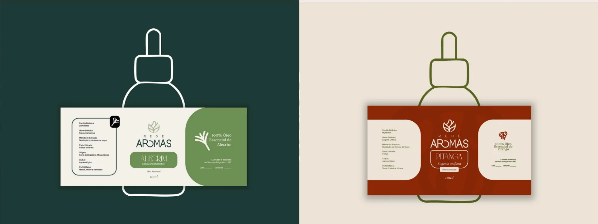
- Bottles and home spray: the labels take on the color of each line, and the Calma home spray brings the brand graphics into the home.
12 plants, one system.
Each species, one color and one illustration.
- Rosemary
- Turmeric
- Lemongrass
- Capim-nagô
- Citronella
- Eucalyptus
- Geranium
- Lavender
- Tea tree
- Basil
- Palmarosa
- Patchouli
The whole label tells the story.
Front, side, the network story and the technical information.
Brazilian flora up front.
Six native species, vibrant illustrations.
Five boxes, one landscape.
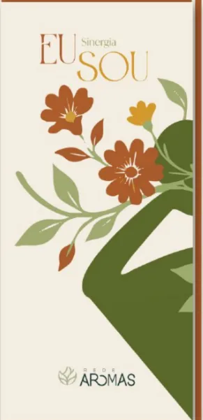
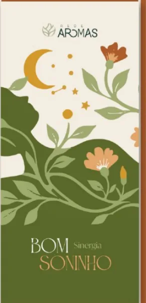
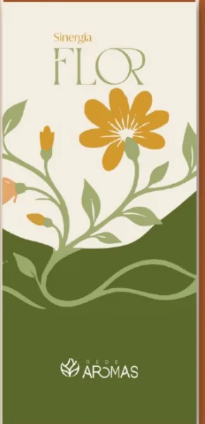
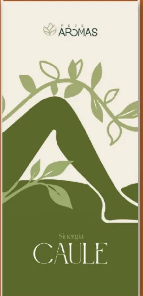
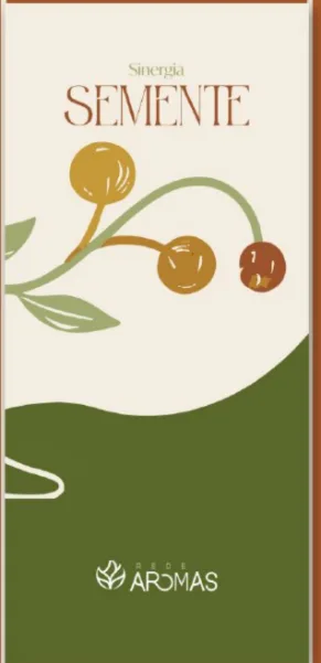
Side by side, the Eu Sou, Bom Soninho, Flor, Caule and Semente blends form a single illustration.
Applications
A brand to wear and carry along.
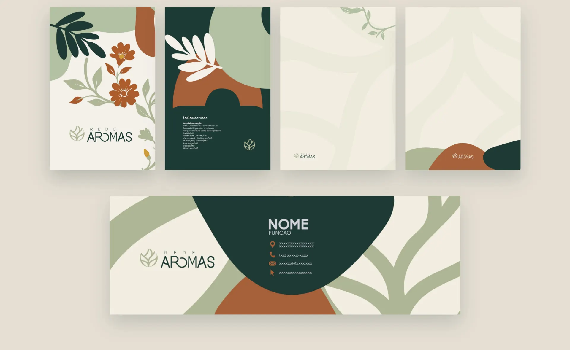
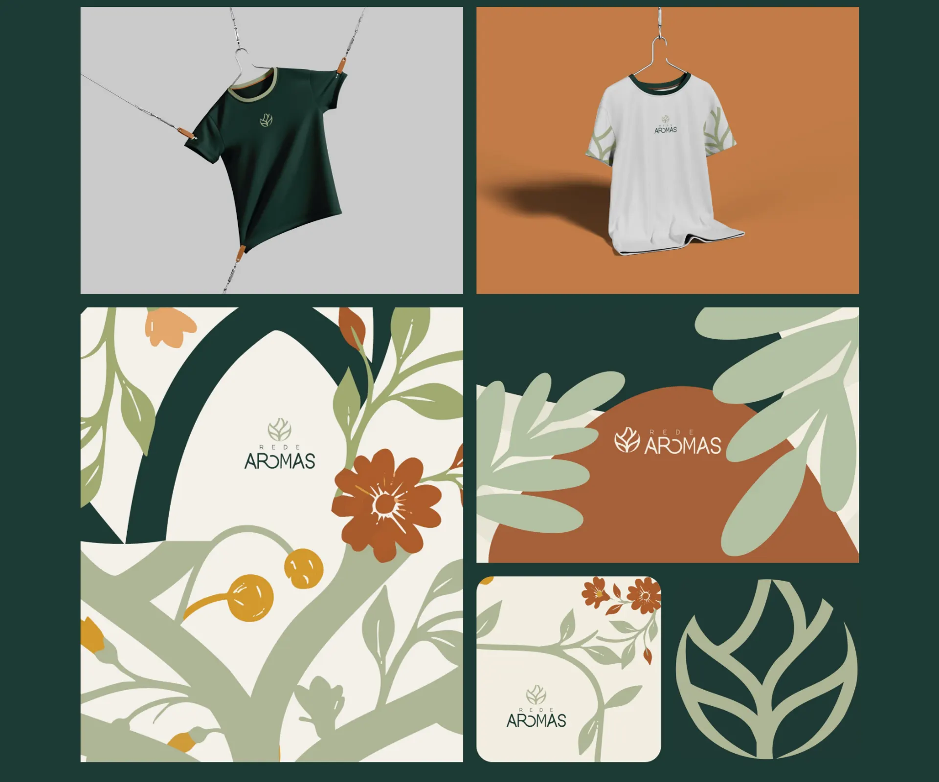
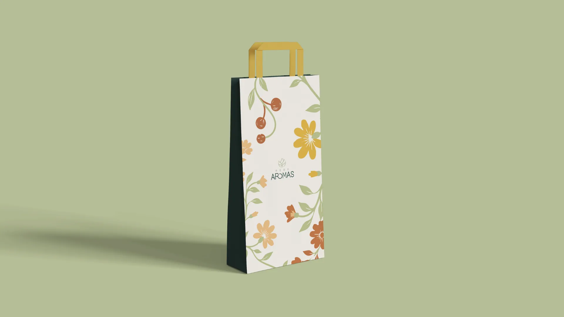
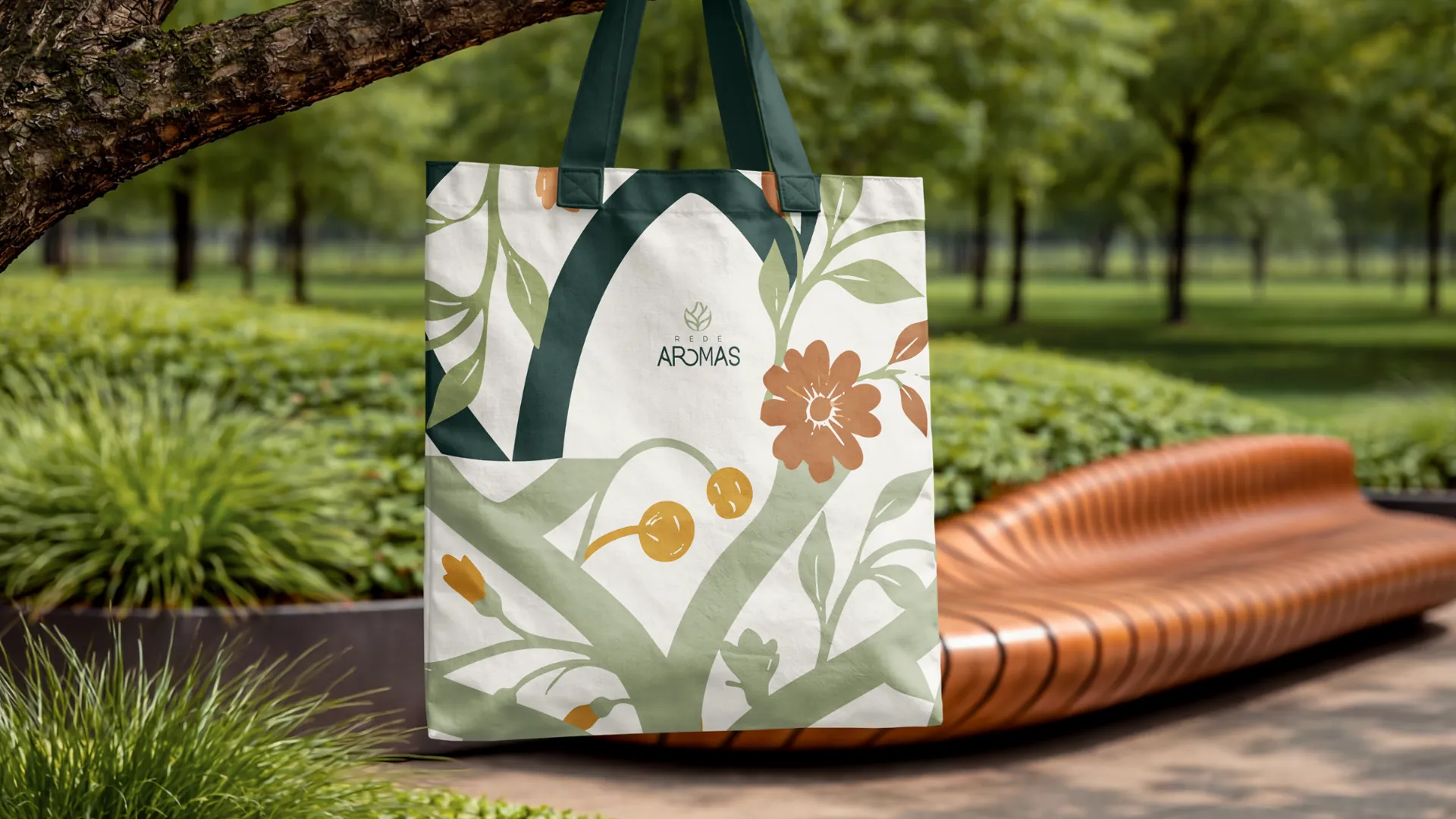
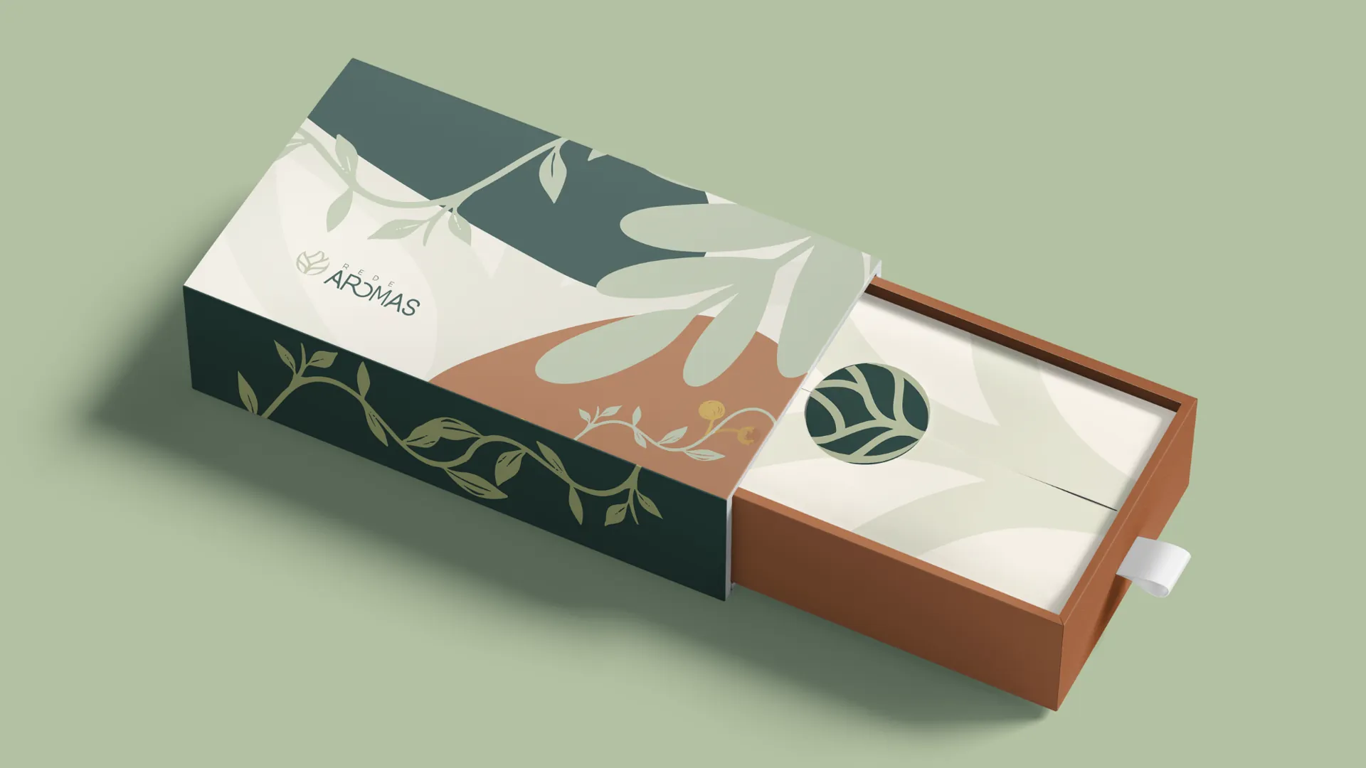
Business cards, letterhead, e-mail signature, T-shirts for the team and for fairs, tote bag, paper bag, gift box and stickers: the same language at every point of contact. The back of the card lists the towns where the network works.
What we delivered
- Consumer survey (141 answers)
- Brand platform: audience, persona, positioning, purpose, values and tone of voice
- Logo and visual identity manual: colors, typography, graphic elements and usage rules
- Packaging for the Classic (12 plants), Native (6 species) and Synergy (5 blends) lines, bottles and home spray
- Stationery and merchandise
- 12-month brand calendar
Does your brand live up to your product?
We start by listening to the people who buy from you and deliver a brand ready to use: logo, visual identity and packaging.